Students spoke. Dal listened.┬Ā
Dal.caŌĆÖs new Study (formerly Academics) and Admissions sections launch this Wednesday (Aug. 28) after months of research, planning, collaboration, data collection, and content creation. The reorganized and refreshed interface and content are designed to better meet the needs of prospective and current student audiences, as well as improve web accessibility and functionality.
During the discovery phase of the Dal.ca Web Renewal Project, both prospective and current student audiences shared that the content they relied on most in the Academics and Admissions sections of Dal.ca was challenging to navigate and used terms that were difficult for new students to understand.┬Ā
Changing the word "Academics" to the more user-friendly title ŌĆ£StudyŌĆØ is one of the first changes youŌĆÖll notice in the main navigation, but updates to make the language clearer and more user-focused are evident throughout. Following the best practices in the (login required), the structure of the content has been reorganized and streamlined, and a new glossary has been developed to help students understand terms that are used in higher education that may be new to them. ┬Ā
ŌĆ£Academics, is that something to do with professors?ŌĆØ Question from a current student during a user research session.
A new way to explore programs
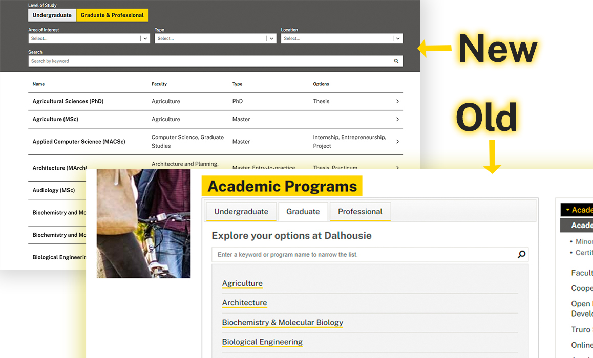
Program pages are some of the most visited content on Dal.ca. Feedback from students showed that they need a way to search for and compare different program offerings, and that the current model of having program information presented on multiple web pages in a variety of formats and locations was confusing and difficult to navigate.┬Ā
Enter the new program explorer. This tool allows students to search programs and see crucial information about each at a glance. Students also have the option to browse programs by broad areas of interest, so if they are not familiar with the names of programs, Faculties, or units, they can still find the content they are looking for.

The foundation of the program explorer are the new program detail pages. The layout for the new program pages was developed through an agency-led research and design process, which included wireframe workshops with program subject matter experts and close consultation with the RegistrarŌĆÖs Office and the Faculty of Graduate Studies. The refreshed program pages are more consistently structured than the current iteration, allowing students to more easily understand and compare them.┬Ā
Data was gathered for each program,which supports filtering options for the program explorer and allows students to quickly determine key information like credentials, faculty information, program options, and more.

The scope of the new program pages is also more comprehensive, including all degrees, diplomas and minors at both the undergraduate and graduate levels. To develop the program page content, thousands of pages across Dal.ca were reviewed by the Communications, Marketing and Creative Services (CMC) team to consolidate key information on programs into a single, user-friendly source of information. ┬Ā
The draft pages were, in turn, reviewed by subject-matter experts in the Faculty of Graduate Studies and the RegistrarŌĆÖs Office. The information collected was used by the ITS (Information Technology Services) Web Team to develop the new, advanced functionality for the program explorer and program pages.
ŌĆ£Sometimes navigating is fine, but most of the time I find that I have to click about 5 links to get to where I need to go.ŌĆØ ŌĆō Prospective student
Work on Dal.ca continues
The volume of information related to programs on Dal.ca necessitates a phased approach to program content. Next steps for program pages will include auditing unit sites through the (login required), to identify duplicated program content and transitioning graduate program content housed in various locations to the program pages. The performance of newly released Study and Admissions pages will be closely monitored to identify opportunities for improvement.╠²╠²
Information about upcoming launches will be shared as it becomes available. An AEM Touch UI training course is under development to further support those who have completed the preliminary stages of the Site Transition Program. In the meantime, the best way to prepare to launch your web content is continued work towards completion of the (login required).
Feedback and support
The Dal community is welcome to provide feedback on the newly launched pages, or any aspect of Dal.ca, using the .╠²╠²
For questions about the or , email the Web Renewal Project Team atŌĆ»web.project@dal.ca or send a message on theŌĆ»ŌĆ»

